Clear checkout page

Clear checkout page

Led the redesign of the checkout experience to reduce friction, improve transparency, and increase confidence at the point of purchase.


Outcome:

  • 2% increase in checkout completion rate following A/B testing and full rollout.

Led the redesign of the checkout experience to reduce friction, improve transparency, and increase confidence at the point of purchase.


Outcome:

  • 2% increase in checkout completion rate following A/B testing and full rollout.

Role

UX Designer - UI tester

UX Designer - UI tester

Duration

8 weeks

8 weeks

Platform

Mobile, Desktop

Mobile, Desktop

Toolkit

Figma, Figjam, Asana

Figma, Figjam, Asana

The challenge

The challenge

Funnel analysis showed consistent drop-off across checkout steps, with the most significant abandonment occurring before payment entry.

Funnel analysis showed consistent drop-off across checkout steps, with the most significant abandonment occurring before payment entry.

Key drop-off points

Key drop-off points

This indicated that users were not failing at payment, they were failing at decision confidence before committing to purchase.

This indicated that users were not failing at payment, they were failing at decision confidence before committing to purchase.

56%

drop-off between the Review page and checkout 1

drop-off between the Review page and checkout 1

27%

drop-off between checkout 1 and checkout 2 page

drop-off between checkout 1 and checkout 2 page

26%

drop-off between checkout 2 page and order complete

drop-off between checkout 2 page and order complete

Insights

Insights

The biggest barrier to conversion was not usability, it was trust at the point of commitment.

  • Users did not abandon because checkout was broken.

  • They abandoned because it felt uncertain.

  • This shifted the focus from simplifying steps to increasing clarity, reassurance, and perceived control.

The biggest barrier to conversion was not usability, it was trust at the point of commitment.

  • Users did not abandon because checkout was broken.

  • They abandoned because it felt uncertain.

  • This shifted the focus from simplifying steps to increasing clarity, reassurance, and perceived control.

Key hypothesis

Key hypothesis

If we reduce uncertainty in pricing, subscription clarity, and commitment expectations at the point of checkout, users will feel more confident completing their purchase.

If we reduce uncertainty in pricing, subscription clarity, and commitment expectations at the point of checkout, users will feel more confident completing their purchase.

Problem definition

Problem definition

Customers were abandoning their orders during checkout due to friction, unclear pricing, and multi-step processes. Even after showing strong purchase intent on the review page, users struggled to complete the process, leading to lost revenue and decreased trust in the brand.

Customers were abandoning their orders during checkout due to friction, unclear pricing, and multi-step processes. Even after showing strong purchase intent on the review page, users struggled to complete the process, leading to lost revenue and decreased trust in the brand.

Scope

Scope

What’s in scope?

Checkout pages

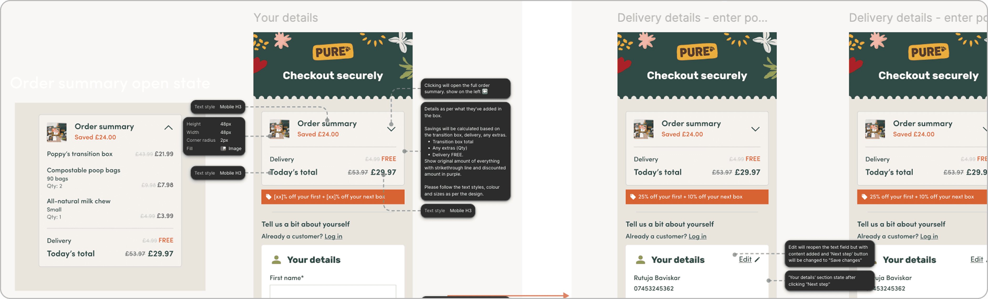
Review & simplify the design and layout of the details, checkout & payment pages

Review & simplify the design and layout of the details, checkout & payment pages

Promote benefits

Clear benefits shown to the customer at point of checking out.

Clear benefits shown to the customer at point of checking out.

Discount code

Clearly showing discount codes if available/applicable to the customer

Clearly showing discount codes if available/applicable to the customer

Transparency on price

Ensure that the user can clearly see how much they’re paying before hitting the ‘complete order’ button

Ensure that the user can clearly see how much they’re paying before hitting the ‘complete order’ button

What’s not in scope?

Data collection

Data collection for analysis for drop outs in not needed at this stage

Data collection for analysis for drop outs in not needed at this stage

Promote benefits

Not adding new or any other payment options to the checkout

Not adding new or any other payment options to the checkout

Updates to other pages

No changes to the plan review page or any other pages in the funnel

No changes to the plan review page or any other pages in the funnel

Update to contact channels

Updating the contact channels including live chat gateaway

Updating the contact channels including live chat gateaway

Primary user persona - The efficiency driven shopper

Primary user persona - The efficiency driven shopper

Age:

32y/o

Occupation:

School teacher

Location:

Manchester, UK

Dog:

Cocoa the Huskey: 5 years

Cocoa & Emily

I don’t mind subscribing, I just need to trust what I’m signing up for before I hit pay.

Behaviour pattern

Emily is not resistant to buying. If the checkout feels long, confusing, or slightly risky, she abandons it with the intention of coming back but never does.

Goals

  • Quick and hassle-free checkout

  • Clear understanding of what she’s paying and why

Pain points

  • Hidden fees or unclear pricing late in checkout

  • Long multi-step checkouts that feel repetitive

Research

Research

Competitive analysis

Competitive analysis

Explored direct and indirect competitor checkout experiences to understand what drives success and where users may struggle. Created a structured competitor board, breaking down screenshots with annotations covering effective patterns, usability issues, and innovative approaches.

Key takeaways included:

  • Competitors place benefits near price for more reassurance, not elsewhere

  • Most of the brands were using one page for all checkout details

  • Subscription based brand have added ‘cancel anytime’ text at the final stage

  • Express payment (Apple Pay / Google Pay) increasingly default

Explored direct and indirect competitor checkout experiences to understand what drives success and where users may struggle. Created a structured competitor board, breaking down screenshots with annotations covering effective patterns, usability issues, and innovative approaches.

Key takeaways included:

  • Competitors place benefits near price for more reassurance, not elsewhere

  • Most of the brands were using one page for all checkout details

  • Subscription based brand have added ‘cancel anytime’ text at the final stage

  • Express payment (Apple Pay / Google Pay) increasingly default

Design decisions

Before

After

Multi-step checkout

Combined into 1 step, removed a drop-off point

Discount code not visible

Added a clearer discount applied label

Hidden or unclear pricing

Full transparent order summary

No reassurance before order completion

Added subscription benefits section

Payment hierarchy unclear

Promoted Apple Pay/Google Pay in future iteration

Design phase

Design phase

User flows

User flows

We focused on three core levers:

1. Reduce friction in decision-making

  • Consolidated checkout from 2 pages into 1 streamlined flow

  • Removed unnecessary step transitions that caused hesitation

2. Increase transparency

  • Made full pricing breakdown visible earlier

  • Clearly surfaced discounts and delivery costs

  • Ensured users understood total cost before payment

3. Build trust at point of purchase

  • Added clear subscription benefits near pricing

  • Reinforced cancellation flexibility (“cancel anytime” patterns)

  • Improved clarity of what users are committing.

A very high-level user flow was created to understand the process.

We focused on three core levers:

1. Reduce friction in decision-making

  • Consolidated checkout from 2 pages into 1 streamlined flow

  • Removed unnecessary step transitions that caused hesitation

2. Increase transparency

  • Made full pricing breakdown visible earlier

  • Clearly surfaced discounts and delivery costs

  • Ensured users understood total cost before payment

3. Build trust at point of purchase

  • Added clear subscription benefits near pricing

  • Reinforced cancellation flexibility (“cancel anytime” patterns)

  • Improved clarity of what users are committing.

A very high-level user flow was created to understand the process.

Wireframes

Wireframes

I started working on different ideations on paper and then turned them into digital wireframes.

I started working on different ideations on paper and then turned them into digital wireframes.

Validation and testing

Validation and testing

A fully interactive prototype was created on figma make was tested with users on Userbrain.

A fully interactive prototype was created on figma make was tested with users on Userbrain.

Participant details

Participant details

6

Total testers

6/6

Females

6/6

Dog owners

18-50

Age range

Feedback

Feedback

Positive feedback

Positive feedback

“Every page made complete sense, anyone could check out without support.”

“Very clean and clear flow, nothing confusing.”

Negative feedback

Negative feedback

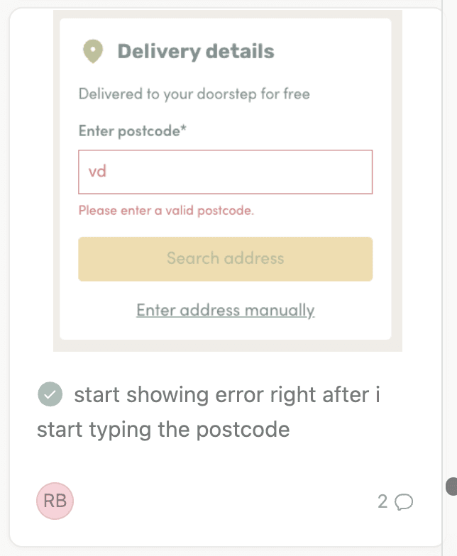
“Delivery fee wasn’t obvious, if there is one, it needs to be clearer.”


“Delivery fee wasn’t obvious, if there is one, it needs to be clearer.”

Design rollout and results

Design rollout and results

The redesigned checkout was A/B tested over 4 weeks. Test was successful and rolled out to 100% of users.

The redesigned checkout was A/B tested over 4 weeks. Test was successful and rolled out to 100% of users.

Phase 1 designs

Phase 1 designs

Outcome and impact

Outcome and impact

The redesigned checkout was A/B tested over 4 weeks. Test was successful and rolled out to 100% of users.

The redesigned checkout was A/B tested over 4 weeks. Test was successful and rolled out to 100% of users.

Removed major abandonment step by combining pages

2%

overall uplift in checkout completion

Created foundation for future optimisation

Phase 2 - Payment optimisation

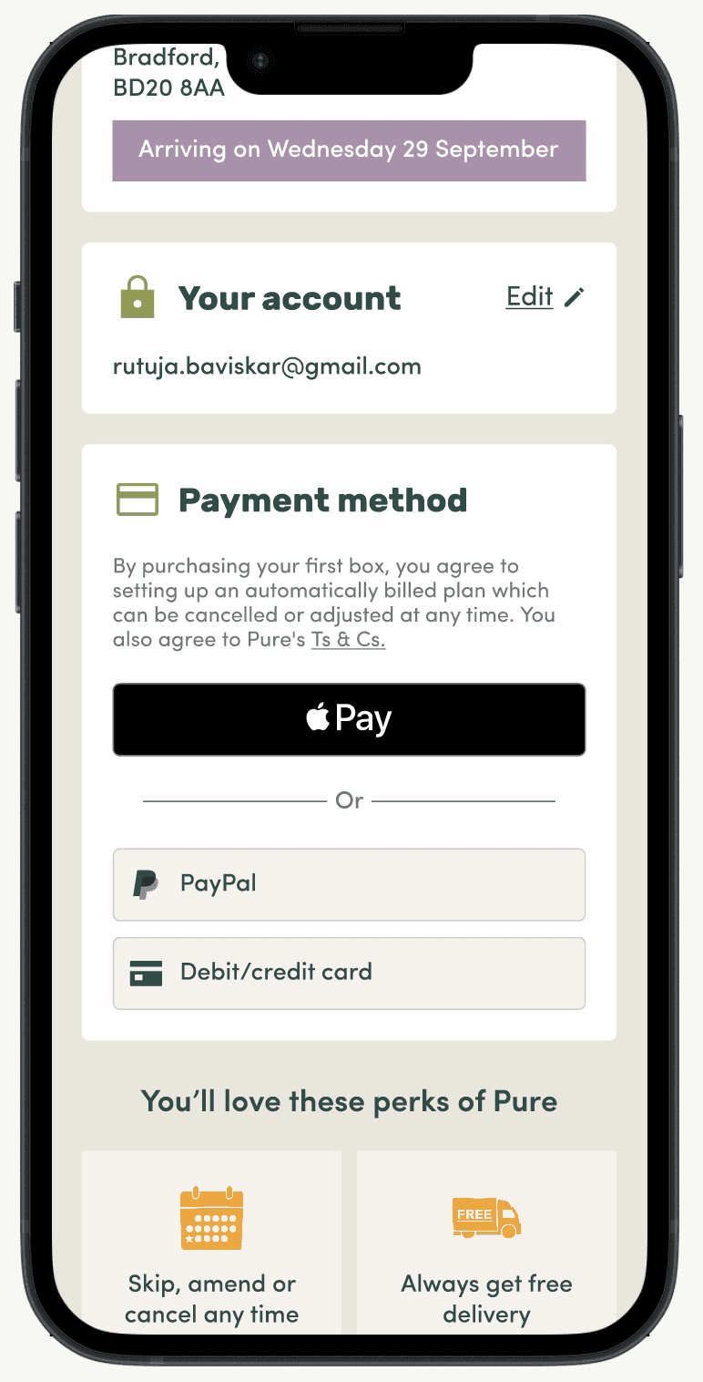
Post-launch analysis showed higher conversion rates from users utilising express payment methods (Apple Pay / Google Pay).

Objective

Increase checkout completion by prioritising faster, lower-friction payment methods.

Approach:

  • Promoted express payment options more prominently in the checkout hierarchy

  • Reduced reliance on manual card entry flow where possible

Phase 2 designs
Before

After

QA test

QA test

Design handover

Design handover

Conducted a collaborative design handover with developers, QA testers, and the product manager, ensuring alignment on design decisions, technical considerations, and next steps for implementation.

Conducted a collaborative design handover with developers, QA testers, and the product manager, ensuring alignment on design decisions, technical considerations, and next steps for implementation.

Pre-deploy testing

Pre-deploy testing

The testing phase confirmed that all key user flows were working as intended, with the UI meeting a pixel-perfect standard. Any bugs or defects were documented in Asana, assigned to developers, and re-tested once resolved. The project was then successfully deployed after final validation.

The testing phase confirmed that all key user flows were working as intended, with the UI meeting a pixel-perfect standard. Any bugs or defects were documented in Asana, assigned to developers, and re-tested once resolved. The project was then successfully deployed after final validation.

Key takeaways

Key takeaways

Checkout performance is driven more by confidence than UI simplicity

  • Transparency in pricing significantly reduces hesitation

  • Express payment options meaningfully improve conversion rates

  • Even small friction points before payment can heavily impact revenue

  • Checkout optimisation is an ongoing system, not a one-time redesign

Want to see ideas come alive?

Get in touch to find out more about digital experiences to effectively reach and engage customers and target audiences.

© Rutuja Baviskar UX Portfolio 2026

© Rutuja Baviskar UX Portfolio 2026

Want to see ideas come alive?

Get in touch to find out more about digital experiences to effectively reach and engage customers and target audiences.

© Rutuja Baviskar UX Portfolio 2026

Want to see ideas come alive?

Get in touch to find out more about digital experiences to effectively reach and engage customers and target audiences.